
About

My past work includes animation, data visualization, science graphics, editorial photo illustration, and graphic design.
I've worked in research labs, tech startups, and news publications. Additionally, I have a Computer Science degree from Georgia Tech, which I use to automate design and animation tasks.

Ontra Animated Logo
I created the logo and this animation for Ontra, a mobility startup. The animation uses the three main vehicle icons featured in Ontra's app, which I designed around the "O" in the logo to easily transition.
Amarlude Music Video
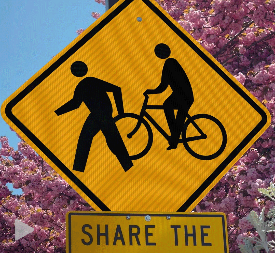
I created this music video for CD-ROM COM, an Atlanta-based rock/funk band. CD-ROM COM gave me a lot of artistic freedom, so I decided that this would be a good opportunity to expand on the style I used in my previous animation series. I wanted to add motion to iconography that people see every day, so I recorded short clips of street signs around Brooklyn. I used After Effects, Photoshop, and the character animation plug-in Rubberhose. I also included an animated montage in the middle of the video to make sure the sign animations didn't get too repetitive.
City Animations
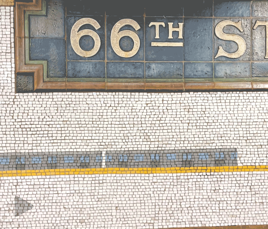
I created this series of animations to brush up on After Effects while I had been primarily working in Illustrator. I used Photoshop and After Effects for most of these. I shot all the footage on my phone to give it an everyday look, while also making it easy to collect footage whenever inspiration struck. In all of these projects I used motion tracking since I filmed the source footage with no tripod. I also added sound effects to make these clips seem more realistic.
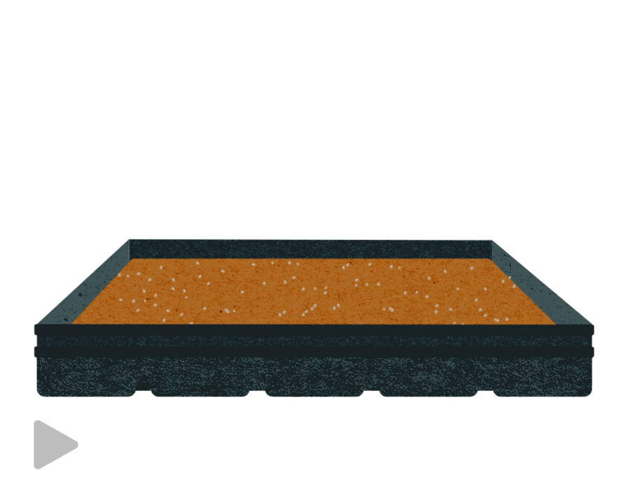
AJC Gas Prices Animation
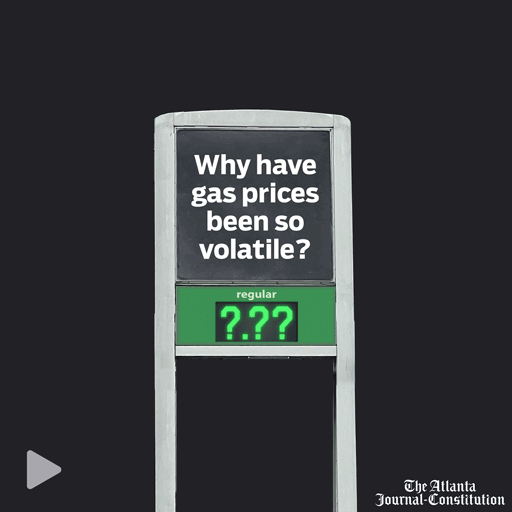
I created this animation as a promotional post for an article on gas prices. I used Adobe Photoshop and Illustrator. I used heavily-edited photos I took at gas stations around Atlanta to create the board, and then animated the moving numbers and zoom in After Effects.
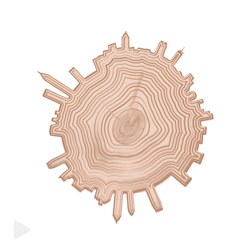
3484 Magazine Climate Issue Promo Video
I created the climate issue promo video for 3484 Magazine using Adobe After Effects and Photoshop. My goal was to create a short promotional video we could post on Instagram to get people excited about the upcoming issue. I animated the original cover Photoshop file in After Effects and then added sound effects. The tree ring animation also highlights the Atlanta skyline in the stump.
3484 Magazine Fall 2020
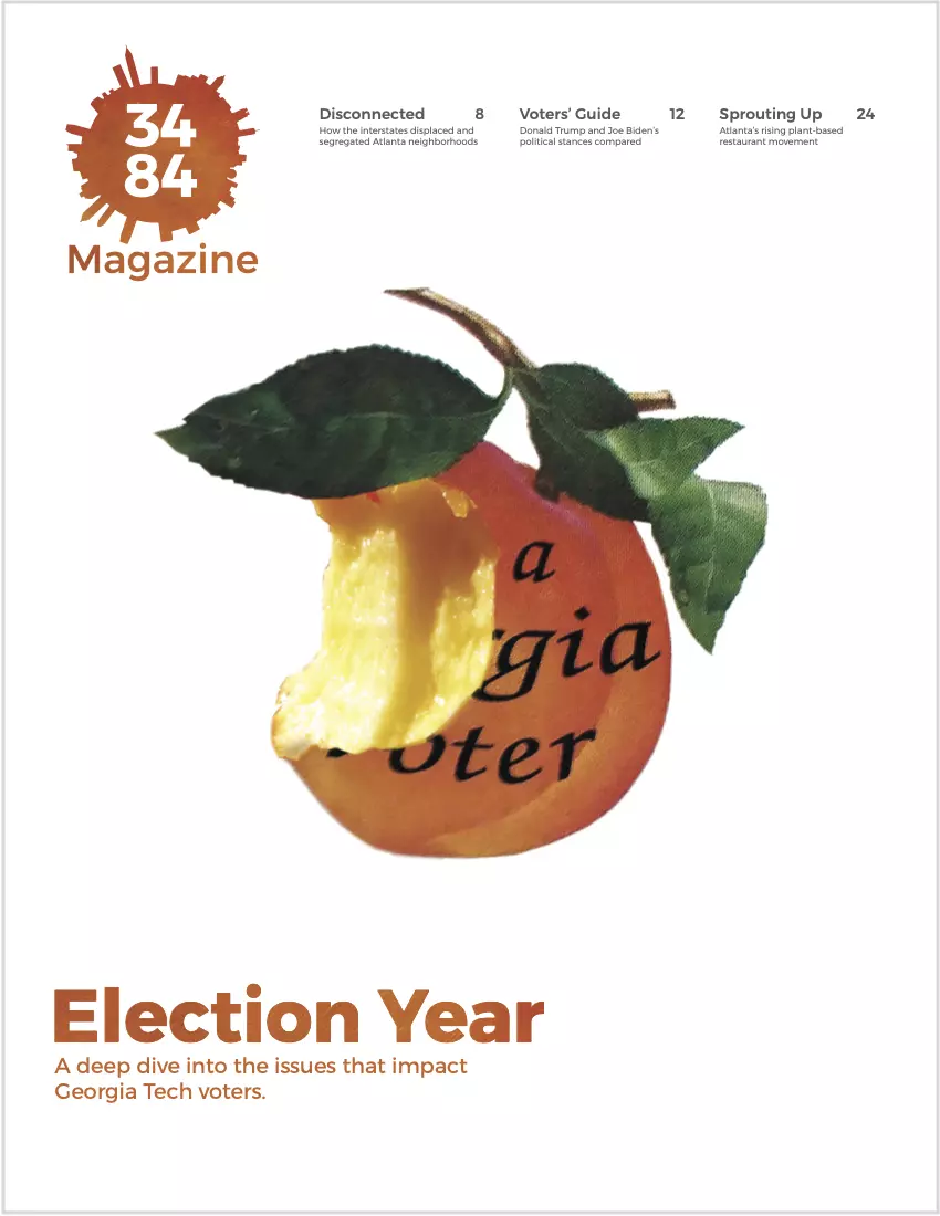
Click here to read full issue.I was in charge of the overall layout and design for this issue. I also fully designed and wrote several articles. This issue delved into issues related to the election, so I styled the cover after Georgia's voter sticker. The peach texture is featured throughout the magazine. As with the Spring 2020 issue, each article has its own line icon, which are combined into a logo variant in the table of contents. The line icons create consistency throughout the magazine while still providing enough room for creative expression. We designed this issue in only a few weeks, as we had to follow a tight deadline in order to publish before the election.

The Kontinua Foundation
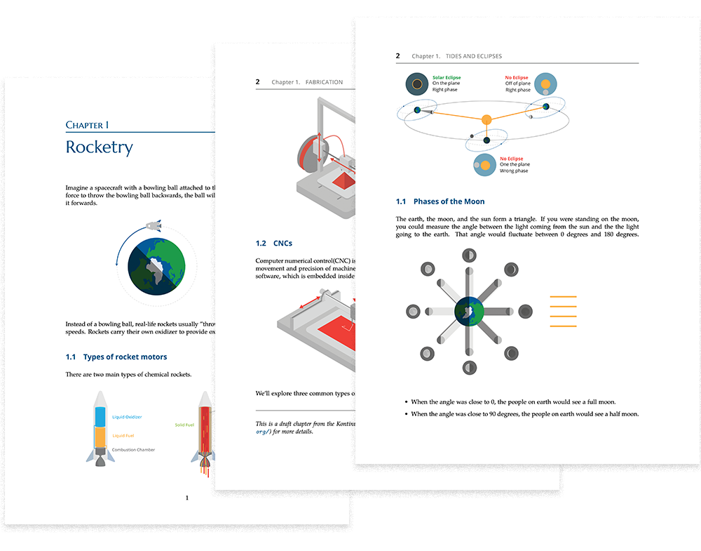
I created all of the illustrations in a series of science and engineering textbooks for an education non-profit.
Each week I would research and learn the topic, plan out how to best teach it, and then begin drafting illustrations.
Since we needed a large amount of illustrations on a fairly tight schedule, I kept the illustrations simple and vector-based. Kontinua expects the textbook chapters to be printed on a school or home printer, so I also ensured that all graphics are relatively light on ink and understandable in color and black and white.
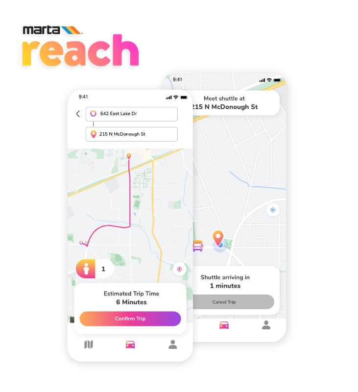
MARTA Reach UX Design and Animation
I designed an app for MARTA, Atlanta's transit organization, which had over 8,000 users during a six month pilot program. I created this video for MARTA to teach users how to use the MARTA Reach app. I designed the UX/UI seen in the video in Adobe XD, and used React to help translate designs into code. I used Adobe After Effects and Illustrator for the video and animation.


